
* i am reposting this description of fortnight collective’s original space in honor of their new expansion
“fortnight collective is a brand marketing accelerator driven by the desire to liberate the strategic and creative development process. with our advertising hack process, fortnight collective tackles brand strategy and campaign development -- all in two weeks. gone are the days of lengthy processes, group-think, and all the things that get in the way of progress. by putting the right talent around the table at the right time, we look to accelerate brand momentum for our clients. in keeping with our rallying cry 'better hustle,' fortnight helps brands be better, faster.” andy nathan, founder and CEO, fortnight collective
as such, fortnight collective required a different kind of office to facilitate their unique brand development approach. we wanted to create a variety of “mini-spaces” to accommodate and encourage the various aspects of fortnight’s working style needs.
(paintings by mark castator)
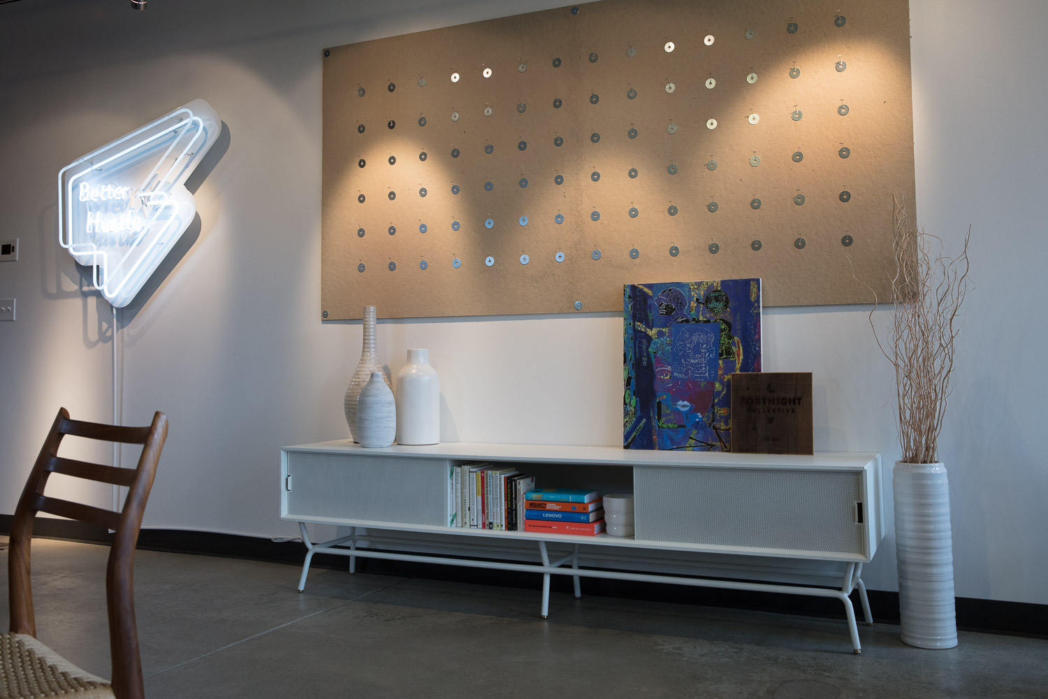
(modern white credenza by bludot)
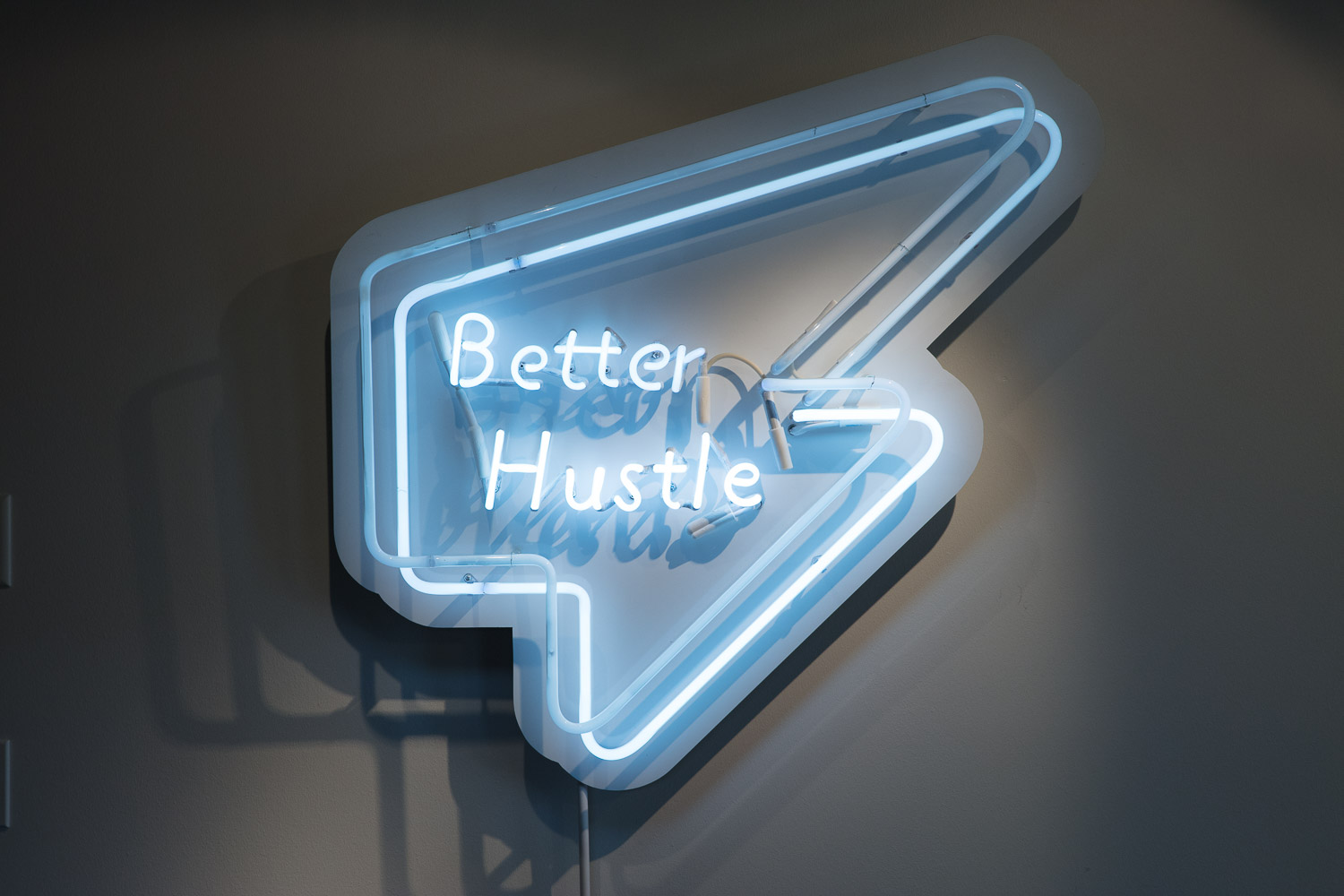
(“better hustle” sign created by morry’s neon signs)
fortnight collective is located two blocks away from downtown boulder’s pearl street. you enter in the middle of the long, rectangular space with floor to ceiling windows on the east end and a deck with sweeping views of the flatirons off the west end. the reception, in the center, has the inviting feel of a warm, mid century modern den. book shelves and a low credenza further the idea of a “living space,” rather than that of a typical office. fortnight’s rallying cry, “better hustle” has been realized in a simple, white neon sign that looks more like an art installation, than company branding.
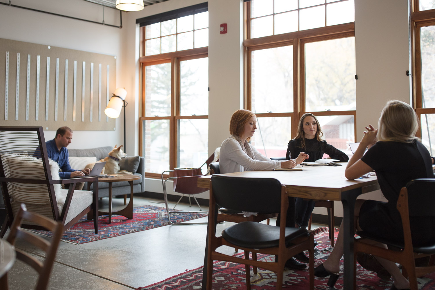
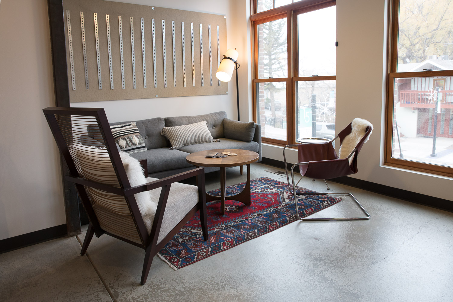
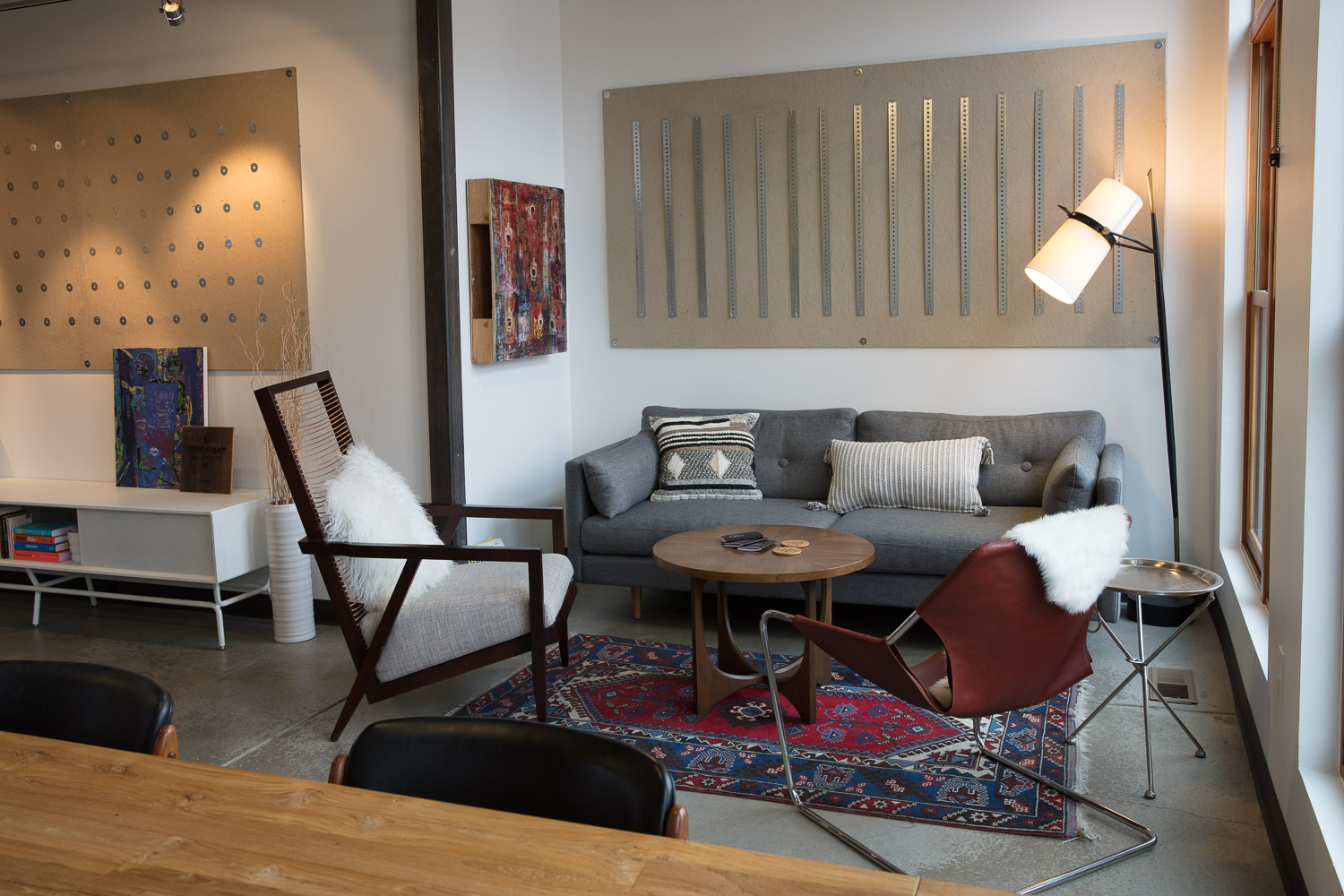
(the “living room” and conference table)
the windowed, eastern front section of fortnight houses a “living room” with comfortable seating and a sofa, ideal for relaxed meetings and more casual discussions. to the right is a long, community table that can host group lunches or meetings that utilize pin boards, the roll in tv or large white erase boards for brainstorming. just beyond is an intimate, round, marble table optimal for small groups or pairs. the vintage bar behind it connects this seating area to the reception space and reiterates the idea of home.
(white bludot desks for individual work)
(large steel art piece by mark castator)
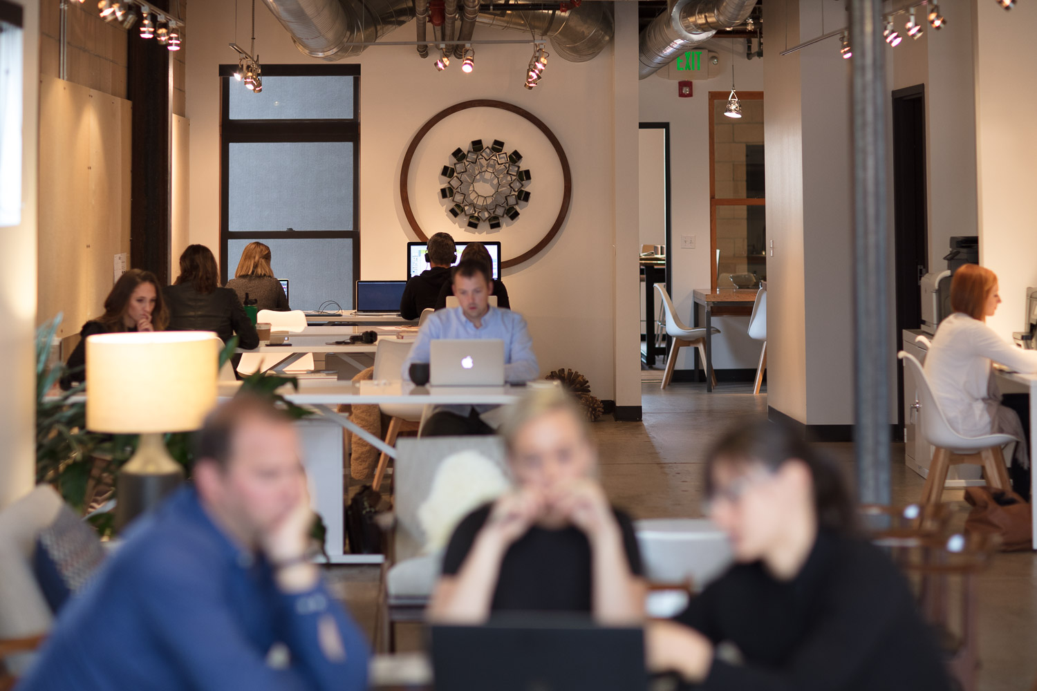
west of reception, there are five white, powdered-coated steel desks. here, fortnight’s employees can work individually. the desks are designed to be flexible so that visitors can also pop in and use them.
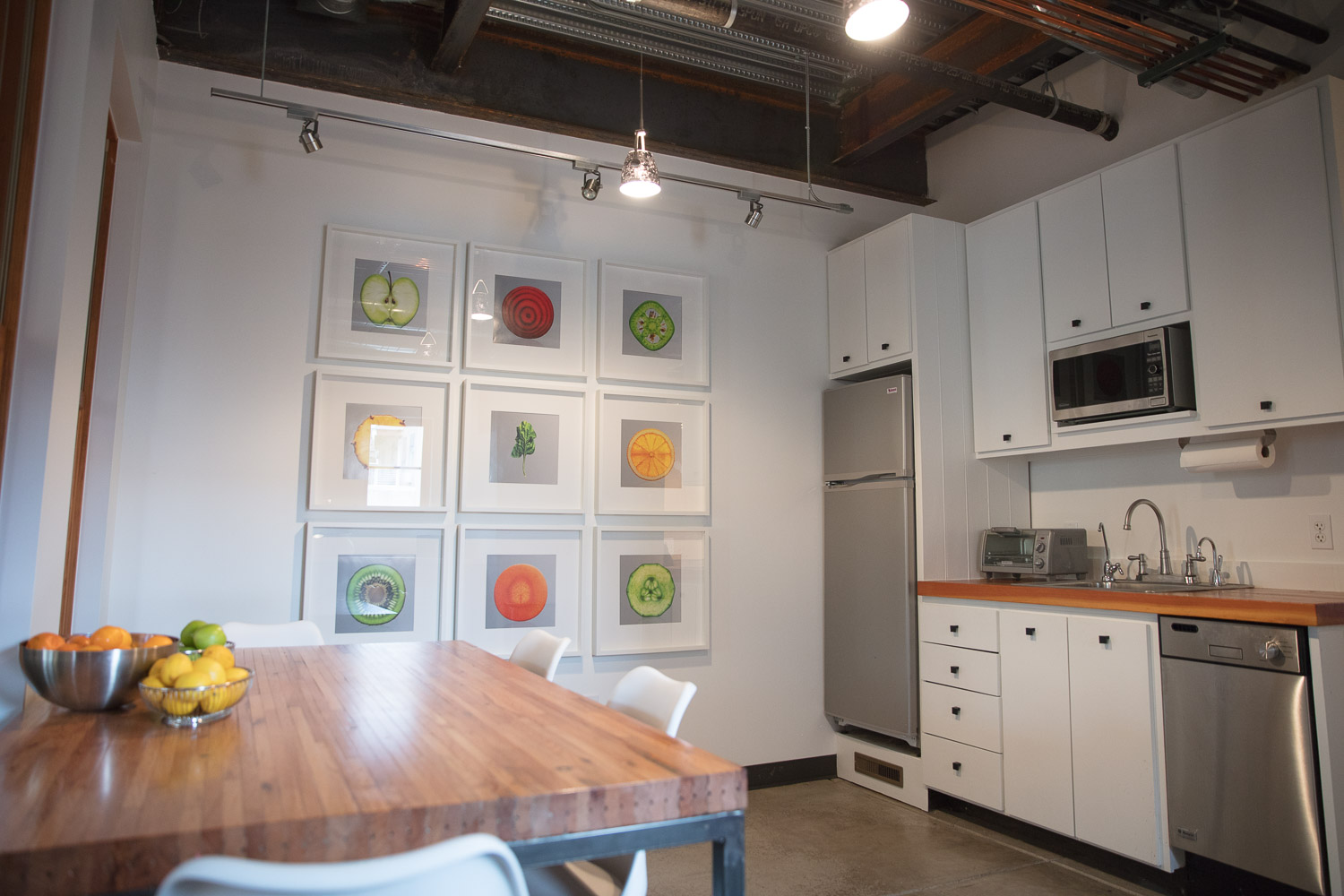
the clean, bright kitchen follows. the northern wall displays nine close-up images of fruit and vegetables from one of fortnight collective’s first campaigns. the photos add color and playfulness to the space and reinforce fortnight collective’s origin story. the simple, white, modern frames against the white walls ensure that the images are focal.
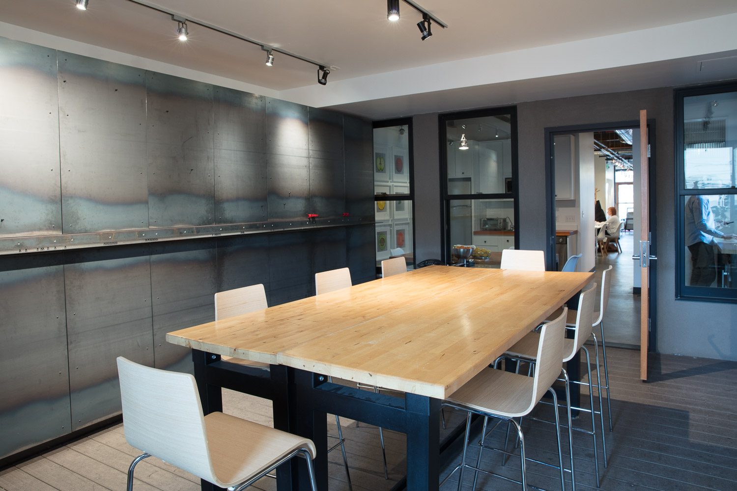
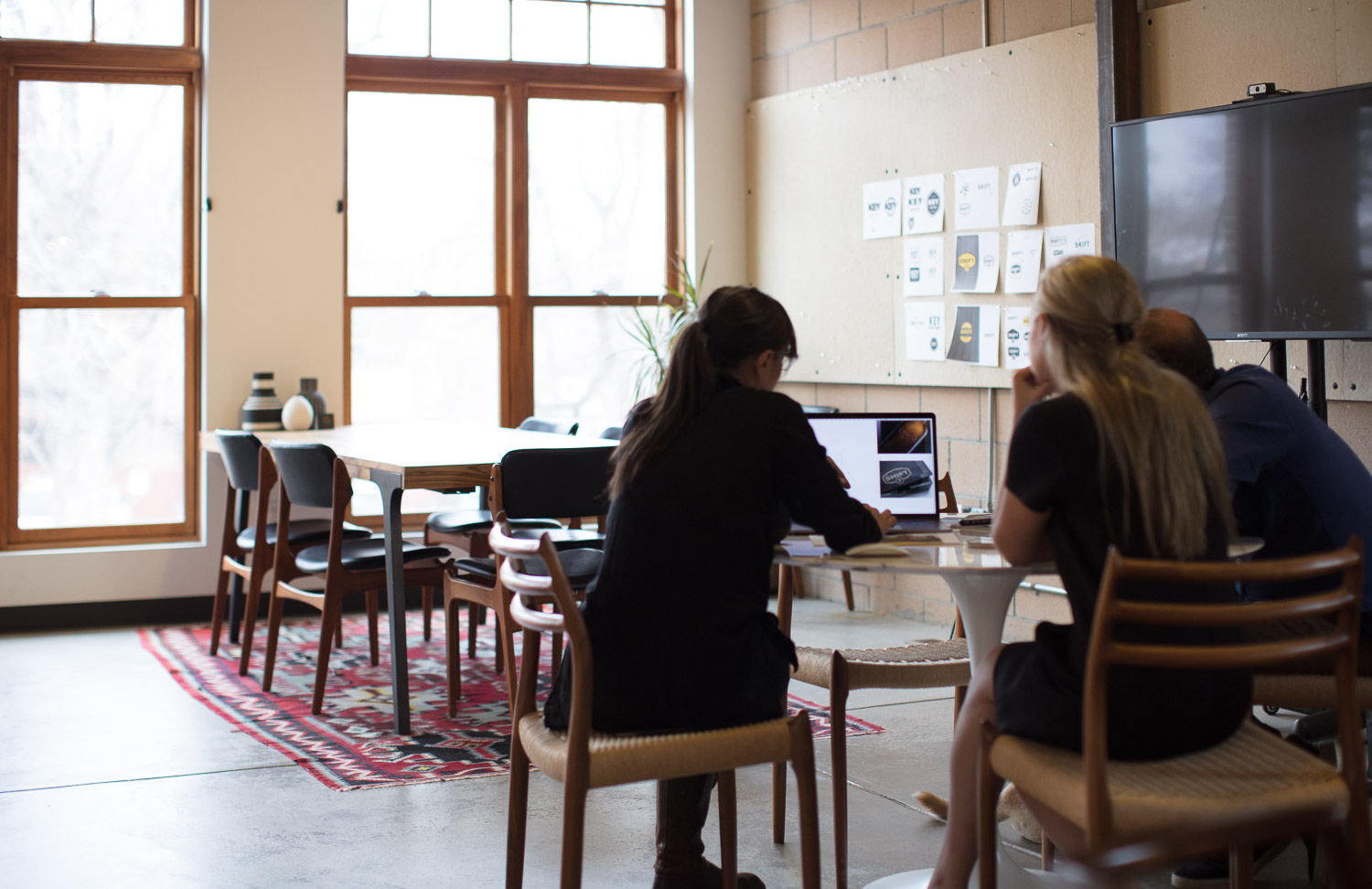
lastly, there is a conference room just before the back deck. this area can be closed off and is perfect for louder, invigorated meetings and “hacks.” there is flexibility in this room as well - the stools collected around the raised table can be reconfigured for various sized groupings.
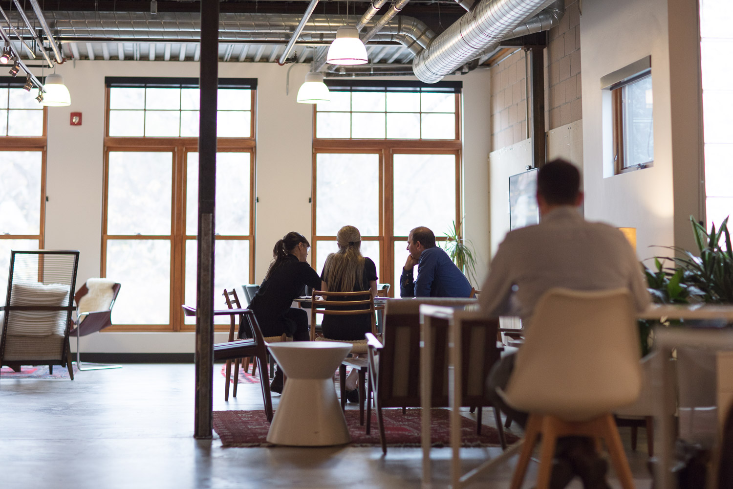
while the “mini-spaces” of fortnight collective serve a range of functions and activities, they are connected by the calm, neutral color palette, hits of white furniture pieces and vintage elements throughout. the industrial details of the space (cement floors, exposed ceiling pipes, steel beams) are complemented by the warm woods, colorful rugs, textured pillows and comfortable seating. fortnight collective’s team and clients have great choice around where they work, think, create, explore and collaborate.
photos: jamie kripke
to read about another commercial space click here